Bad Infographic:
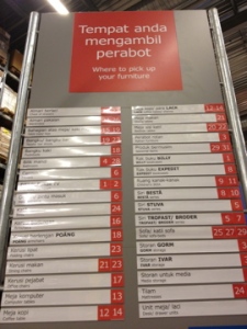
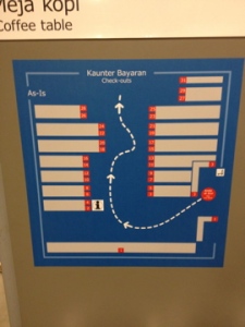
Part 1 Part 2
-It look simple and easy,
-but it’s not convenient for the reader to read it because they need to refer the part 1 for the part 2.
-the design of the info-graphic should make it more iconic and symbolize. To be more visualize.
Good Infographic:
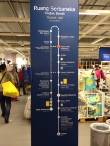
-The color was suitable for their target audience which is not too funky.
-have some color contrast with the used of yellow and red.
-It’s detailing with all the information and easy to understand.


